今回の記事ではBootstrapを使ってボタン押下時にモーダルを表示する方法を解説していきます
テンプレート準備
まずはBootstrapを使うためのテンプレ準備です。以下はBootstrap公式から流用したものでモーダル表示に余計な部分を削ったhtmlファイルです。
<!doctype html>
<html lang="ja">
  <head>
    <!-- Required meta tags -->
    <meta charset="utf-8">
    <meta name="viewport" content="width=device-width, initial-scale=1">

    <!-- Bootstrap CSS -->
    <link href="https://cdn.jsdelivr.net/npm/bootstrap@5.1.3/dist/css/bootstrap.min.css" rel="stylesheet" integrity="sha384-1BmE4kWBq78iYhFldvKuhfTAU6auU8tT94WrHftjDbrCEXSU1oBoqyl2QvZ6jIW3" crossorigin="anonymous">

    <title>Hello, world!</title>
  </head>
  <body>
    <h1>Hello, world!</h1>

    <!-- Option 1: Bootstrap Bundle with Popper -->
    <script src="https://cdn.jsdelivr.net/npm/bootstrap@5.1.3/dist/js/bootstrap.bundle.min.js" integrity="sha384-ka7Sk0Gln4gmtz2MlQnikT1wXgYsOg+OMhuP+IlRH9sENBO0LRn5q+8nbTov4+1p" crossorigin="anonymous"></script>
  </body>
</html>
モーダル準備
表示するモーダルとボタンを用意します。
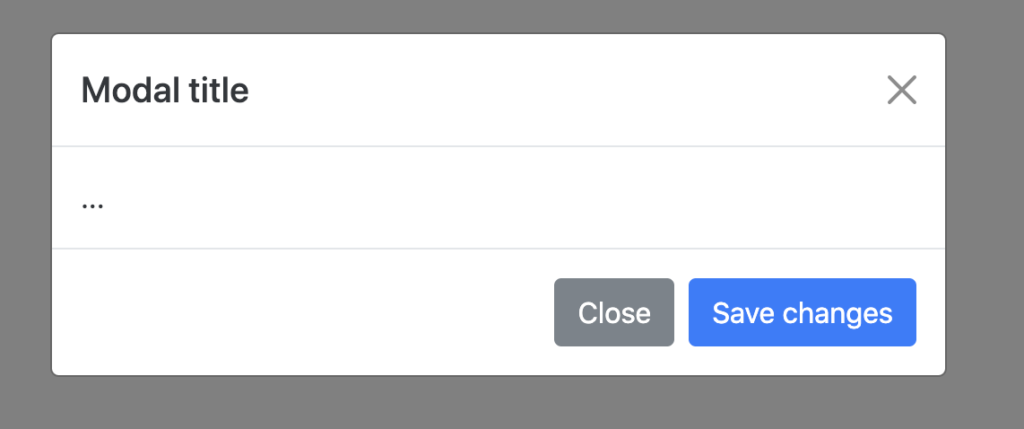
まずはモーダルです。ここで大切たのが、一番大外のdivタグのclass属性にmodalを指定していることと、idをexampleModalとしているところです。
<!-- Modal -->
<div class="modal fade" id="exampleModal" tabindex="-1" aria-labelledby="exampleModalLabel" aria-hidden="true">
  <div class="modal-dialog">
    <div class="modal-content">
      <div class="modal-header">
        <h5 class="modal-title" id="exampleModalLabel">Modal title</h5>
        <button type="button" class="btn-close" data-bs-dismiss="modal" aria-label="Close"></button>
      </div>
      <div class="modal-body">
        ...
      </div>
      <div class="modal-footer">
        <button type="button" class="btn btn-secondary" data-bs-dismiss="modal">Close</button>
        <button type="button" class="btn btn-primary">Save changes</button>
      </div>
    </div>
  </div>
</div>
次にモーダルを表示するためのボタンを設置します。以下のコードを追加してください。
重要なのはbuttonタグのdata-bs-toggle属性にmodelを設定していることとdata-bs-targetにモーダルのidで指定したのと同じexampleMdalを指定していることです。
<!-- Button trigger modal -->
    <button type="button" class="btn btn-primary" data-bs-toggle="modal" data-bs-target="#exampleModal">
        Launch demo modal
    </button>
[affi id=22]
最終的なHTMLは以下のようになります。
<!doctype html>
<html lang="ja">
  <head>
    <!-- Required meta tags -->
    <meta charset="utf-8">
    <meta name="viewport" content="width=device-width, initial-scale=1">

    <!-- Bootstrap CSS -->
    <link href="https://cdn.jsdelivr.net/npm/bootstrap@5.1.3/dist/css/bootstrap.min.css" rel="stylesheet" integrity="sha384-1BmE4kWBq78iYhFldvKuhfTAU6auU8tT94WrHftjDbrCEXSU1oBoqyl2QvZ6jIW3" crossorigin="anonymous">

    <title>Hello, world!</title>
  </head>
  <body>
    <h1>Hello, world!</h1>
    <!-- Modal -->
    <div class="modal fade" id="exampleModal" tabindex="-1" aria-labelledby="exampleModalLabel" aria-hidden="true">
        <div class="modal-dialog">
        <div class="modal-content">
            <div class="modal-header">
            <h5 class="modal-title" id="exampleModalLabel">Modal title</h5>
            <button type="button" class="btn-close" data-bs-dismiss="modal" aria-label="Close"></button>
            </div>
            <div class="modal-body">
            ...
            </div>
            <div class="modal-footer">
            <button type="button" class="btn btn-secondary" data-bs-dismiss="modal">Close</button>
            <button type="button" class="btn btn-primary">Save changes</button>
            </div>
        </div>
        </div>
    </div>
    <!-- Button trigger modal -->
    <button type="button" class="btn btn-primary" data-bs-toggle="modal" data-bs-target="#exampleModal">
        Launch demo modal
    </button>
    <!-- Option 1: Bootstrap Bundle with Popper -->
    <script src="https://cdn.jsdelivr.net/npm/bootstrap@5.1.3/dist/js/bootstrap.bundle.min.js" integrity="sha384-ka7Sk0Gln4gmtz2MlQnikT1wXgYsOg+OMhuP+IlRH9sENBO0LRn5q+8nbTov4+1p" crossorigin="anonymous"></script>
  </body>
</html>
動作確認
動作確認してみます。先ほど作成したhtmlをChromeなどのブラウザで開きます。
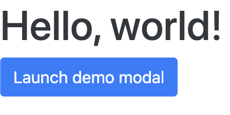
「Launch demo modal」ボタンをクリックするとモーダルが開きます。
以上簡単ですが、Bootstrapを使ってボタン押下時にモーダルを表示する方法でした。